ARCHIE KASHYAPA
UI/UX/VISUAL DESIGNER

Redesigning the bill payment journey
Client: Paytm Canada
Role: Strategy, Product Designer, User Research, Visualization, Prototyping & testing
Objective
At Paytm Canada, every day is a new and exciting challenge. Paytm is the biggest bill payment platform in India and Paytm Canada launched its Canada app to make multiple bill payments easier for everyone in Canada while also receiving points after each payment.
Background
We were 2 designers on the team alongside 2 Project Manager and 10 developers. I was responsible for creating Marketing materials, Product Design and UI/UX experience of the app. Some of my achievements while working at Paytm are listed below.
Apply design sprints - I was able to effectively identify the problem, ideate on the solution, create prototype for testing stage and execute the final product.
Execute end to end - Within a short amount of time, we as a team were able to create and code the final designs.
Understanding the problem
I conducted brainstorming sessions within the team to uncover pain points felt by the user while making bill payments. And It was easier to do within the team as everyone used the app to pay their bills.
-
Individuals wanted an incentive to use the app as they were already making bill payments directly from the bank.
-
Individuals wanted to set up recurring payments as it took a minimum of 5 days for the complete bill payment process back end.
-
Individuals wanted to see fluctuations in the bill payments month on month.
Paytm vision and solution
From the above findings, we decided as a product to identify key business goals:
-
We want the users to understand the impact of making bill payments from the app.
-
We want the users to set their bill payment information once and not have to worry about it again.
We then performed a comparative analysis of our competitors to investigate the current offerings in the market and also took inspiration from a particular feature that we liked about each app.
Design mockup
We first focused on the major problem of late/missing payments and launched a "Bill reminder" feature. We Iterated our wireframe design by conducting usability testing with the low-fidelity wireframe. Our participants provided feedback on the error prevention method, accessibility, and discoverability of the UI.
In order for the engineers to begin the architecture, I mocked up the main screens for the bill reminder screen flow. We launched it on the Paytm Canada website, and on both IOS and Android platforms.
The idea was to take users through 4 steps to achieve their goal.

Designs
With a little time on hand to give the final designs to the developers. I quickly created a clickable prototype in Invision. Then created the final designs on Sketch and handed it over to the developers via Zeplin.
Bill Reminder Screen flow
Getting started to reschedule bill payment
We added reschedule reminder/cancel reminder feature below the pay bill button.

Select Date and Frequency
Select when you would like to be reminded of the payment and the payment frequency

Selection option added on the same screen
We added the drop-down on the same screen to avoid one more step


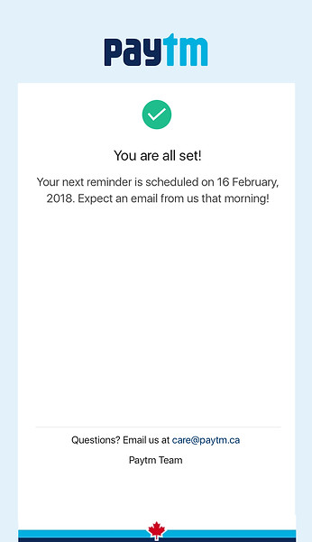
Confirmation screen
Once users select the date and frequency option, confirmation screen is shown of their next bill payment
Key Takeaways
The best designs come from collaboration - Everyone on the team had unique ideas, and the technical team always knows what is possible. It is a great learning environment.
Putting the user first - Understanding the user's pain points and putting their experience first is vital.
Paytm Point Launch
After the Bill reminder feature went live, we then launched Paytm Points to reward the users. We went through the process again and also redesigned our emails.


